
The Importance of Perfect Color Accuracy: Elevating Your Brand Identity through Print
Color is a powerful tool in branding that can evoke emotions, create recognition, and leave a lasting impression. In today’s digital age, where online presence dominates, it’s easy to overlook the importance of color accuracy in print materials. However, for businesses aiming to establish a strong brand identity and maintain consistency across all marketing channels, nailing color accuracy in print is crucial.
In this article, we will explore why color accuracy matters in print and how it can impact your brand identity. We’ll delve into the challenges of achieving accurate colors in the print production process, discuss the role of color management systems, and provide practical tips for ensuring color consistency. Whether you’re designing business cards, brochures, or packaging, understanding the significance of color accuracy in print will help you maintain a cohesive brand identity that resonates with your target audience.
Key Takeaways:
1. Consistent color accuracy is crucial for maintaining brand identity in print.
Ensuring that your brand’s colors are accurately reproduced in print materials is essential for maintaining brand consistency. Inconsistent colors can weaken brand recognition and dilute the impact of your marketing efforts. It is important to work with a professional printer who understands color management and can deliver consistent and accurate results.
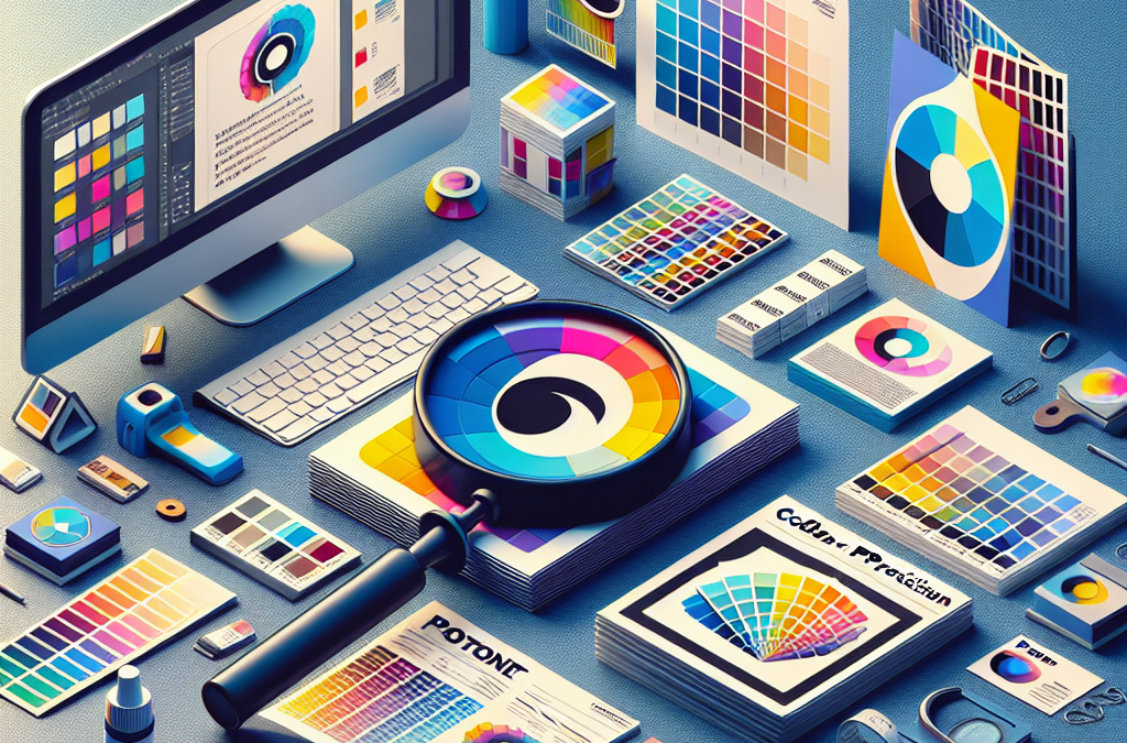
2. Use Pantone Matching System (PMS) for precise color reproduction.
The Pantone Matching System (PMS) is a standardized color system used in the printing industry that allows for precise color reproduction. By specifying PMS colors for your brand, you can ensure that your colors will be consistent across different printing processes and materials. Using PMS colors also makes it easier to communicate your brand’s color palette to designers, printers, and other stakeholders.
3. Invest in high-quality proofing and calibration tools.
To achieve color accuracy in print, it is important to invest in high-quality proofing and calibration tools. These tools help you accurately preview how your printed materials will look and ensure that the colors are reproduced as intended. Regularly calibrating your monitors, printers, and proofing devices is essential for maintaining color accuracy throughout the design and printing process.
4. Communicate color expectations clearly with your printer.
When working with a printer, it is crucial to communicate your color expectations clearly. Provide them with a color sample or a PMS color code to ensure that they understand the desired color accurately. Discuss any specific requirements or concerns you may have regarding color accuracy, and ask for a proof before finalizing the print run to ensure that the colors meet your expectations.
5. Regularly review and update your brand’s color standards.
As your brand evolves, it is important to regularly review and update your brand’s color standards. This includes revisiting your brand’s color palette, updating any PMS colors, and ensuring that all stakeholders are aware of any changes. By regularly reviewing and updating your brand’s color standards, you can ensure that your brand’s colors remain accurate and consistent across all print materials.
The Rise of Color Management Tools
In today’s digital age, where brands are constantly striving to create a consistent and impactful visual identity, color accuracy has become more important than ever. With the increasing use of print materials in marketing and advertising campaigns, nailing your brand identity with print requires precise color reproduction. This has led to the rise of color management tools that help brands achieve accurate and consistent colors across different mediums.
Color management tools, such as color calibration devices and software, enable brands to calibrate their monitors, printers, and other devices to ensure accurate color reproduction. These tools take into account various factors like color profiles, lighting conditions, and device capabilities to ensure consistent colors from screen to print. By using color management tools, brands can maintain the integrity of their brand colors and create a cohesive visual experience for their audience.
Furthermore, color management tools also offer the ability to simulate how colors will appear in different print processes, such as offset printing or digital printing. This allows brands to make informed decisions about color choices and ensure that their designs will look as intended when printed. With the rise of color management tools, brands can have more control over their brand identity and confidently execute their print campaigns.
The Impact of Pantone’s Extended Gamut Printing
Pantone, a leading authority in color systems, has recently introduced Extended Gamut Printing (EGP) as an alternative to traditional spot color printing. EGP expands the color gamut by using a fixed set of inks to reproduce a wider range of colors, including those traditionally achieved through spot colors. This development in printing technology has significant implications for brands looking to maintain color accuracy in their print materials.
Traditionally, achieving accurate spot colors required the use of specific inks mixed in precise ratios. This process could be time-consuming and costly, especially when dealing with multiple spot colors. However, with EGP, brands can achieve a wider range of colors using a fixed set of inks, simplifying the printing process and reducing costs. This technology allows brands to accurately reproduce their brand colors without the need for custom spot colors, making it easier to maintain consistency in print materials.
In addition to cost and time savings, EGP also offers environmental benefits. By reducing the need for custom spot colors, brands can minimize ink waste and reduce their environmental footprint. This aligns with the growing trend of sustainability in the printing industry, where brands are increasingly conscious of their impact on the environment.
The Future of Color Accuracy in Augmented Reality (AR) and Virtual Reality (VR)
As technology continues to advance, the future of color accuracy in print extends beyond traditional mediums. Augmented Reality (AR) and Virtual Reality (VR) are emerging as powerful tools for brands to engage with their audience in immersive ways. However, ensuring color accuracy in these digital experiences presents new challenges.
AR and VR environments rely on digital displays and projectors to create virtual worlds. These displays have their own color profiles, rendering capabilities, and lighting conditions, which can impact color accuracy. Brands will need to consider color management in these digital environments to ensure that their brand colors are accurately represented.
Furthermore, as AR and VR technologies evolve, the integration of print materials within these experiences will become more prevalent. Brands may use AR markers or QR codes on printed materials to trigger digital content in AR or VR environments. In these cases, maintaining color accuracy between the physical and digital components will be crucial to creating a seamless and immersive brand experience.
Brands will need to explore color management solutions specifically designed for AR and VR environments to ensure accurate color reproduction. This may involve developing color profiles for specific devices or creating color calibration tools that can be used in conjunction with AR and VR technology. As AR and VR become more mainstream, color accuracy in these digital experiences will be essential for brands to maintain their visual identity.
The Importance of Color Accuracy
One of the controversial aspects of ‘Color Accuracy Matters: Nailing Your Brand Identity with Print’ is the emphasis on color accuracy. While it is true that color accuracy is crucial for maintaining a consistent brand identity, some argue that it may not be as important as other aspects of branding.
Proponents of color accuracy argue that it plays a significant role in creating a strong brand identity. Consistency in color across various marketing materials helps customers recognize and remember a brand. It builds trust and credibility, as customers associate certain colors with specific brands. In this sense, color accuracy is seen as an essential element in establishing a brand’s visual identity.
However, critics argue that color accuracy should not be the sole focus when it comes to brand identity. They contend that other factors, such as messaging, design, and customer experience, are equally important, if not more so. While color can be a powerful tool in branding, it should not overshadow the overall brand strategy.
The Challenges of Achieving Color Accuracy
Another controversial aspect of ‘Color Accuracy Matters: Nailing Your Brand Identity with Print’ is the assumption that achieving color accuracy is a straightforward process. While the article provides valuable insights into color management techniques, critics argue that it oversimplifies the challenges involved.
Proponents of the article’s viewpoint argue that with the right tools and processes, achieving color accuracy is achievable. They highlight the importance of using calibrated monitors, color profiles, and proofing systems to ensure consistency. They believe that by following these best practices, brands can overcome the challenges and achieve the desired color accuracy.
However, critics argue that color accuracy is not always easy to achieve, especially in the print industry. Factors such as different printing technologies, substrates, and lighting conditions can affect color reproduction. They argue that the article fails to address these complexities adequately and may give readers a false sense of confidence in achieving color accuracy.
The Role of Print in Brand Identity
The article ‘Color Accuracy Matters: Nailing Your Brand Identity with Print’ places a strong emphasis on the role of print in brand identity, which is another controversial aspect. While print materials can indeed play a significant role in branding, critics argue that the digital landscape cannot be ignored.
Proponents of print argue that it offers a tangible and tactile experience that digital media cannot replicate. They believe that print materials, such as business cards, brochures, and packaging, create a lasting impression on customers and help establish a brand’s identity. They argue that the physicality of print adds value to a brand’s overall marketing strategy.
On the other hand, critics contend that in today’s digital age, online presence and digital marketing channels are equally, if not more, important. They argue that focusing solely on print materials may limit a brand’s reach and impact. With the majority of consumers now relying on digital platforms, brands need to adapt their strategies to include online channels to effectively build their identity.
While ‘Color Accuracy Matters: Nailing Your Brand Identity with Print’ provides valuable insights into the importance of color accuracy and its role in brand identity, it is not without controversy. The emphasis on color accuracy, the challenges involved, and the role of print in branding all spark debates among professionals in the field. It is essential for brands to consider a balanced viewpoint, taking into account other aspects of branding and the evolving digital landscape.
Insight 1: The Impact of Color Accuracy on Brand Perception
Color plays a crucial role in brand identity, as it has the power to evoke emotions, convey messages, and create a distinct visual identity. In the world of print, color accuracy is paramount to ensuring that a brand’s image is consistent across various marketing materials. When colors are not reproduced accurately, it can lead to a misrepresentation of the brand and a disconnect with the target audience.
Imagine a scenario where a company’s logo, which is typically a vibrant shade of blue, appears dull and washed out on printed materials. This inconsistency in color can undermine the brand’s credibility and professionalism, as customers may perceive the company as being careless or untrustworthy. On the other hand, when colors are reproduced accurately, they can reinforce brand recognition and create a sense of trust and consistency. Customers are more likely to remember and resonate with a brand that consistently delivers a visually appealing and cohesive experience.
Moreover, color accuracy is particularly crucial for industries where color is a defining characteristic of the product or service. For example, in the cosmetics industry, accurate color reproduction is essential to showcase the true shades of makeup products. Customers rely on the accuracy of printed materials, such as catalogs or product packaging, to make informed purchasing decisions. A deviation from the actual colors can lead to customer dissatisfaction and potentially result in negative reviews or returns.
Insight 2: The Role of Technology in Achieving Color Accuracy
Advancements in technology have significantly improved the ability to achieve color accuracy in print. Traditional printing methods, such as offset printing, often faced challenges in reproducing colors accurately due to limitations in ink mixing and calibration. However, with the advent of digital printing and color management systems, brands now have greater control over the color reproduction process.
Digital printing technologies, such as inkjet and laser printing, offer precise color control, allowing brands to achieve consistent color accuracy across various print materials. These technologies utilize sophisticated color management systems that ensure accurate color reproduction by calibrating printers, monitors, and other devices involved in the printing process. By implementing color management systems, brands can establish color standards and profiles, ensuring that the desired colors are reproduced consistently across different print runs and printing devices.
Additionally, the use of spectrophotometers and color measurement devices has become commonplace in the printing industry. These devices measure color accurately, providing quantitative data that can be used to calibrate printers and ensure color consistency. With the help of color measurement devices, printers can make precise adjustments to achieve the desired color accuracy, reducing the chances of color discrepancies.
Insight 3: The Importance of Collaboration between Brands and Printers
Achieving color accuracy in print is a collaborative effort between brands and printers. It requires open communication, shared understanding of brand guidelines, and a willingness to work together to achieve the desired results. Collaboration between the brand and the printer starts with establishing clear expectations and providing detailed color specifications.
Brands should provide printers with accurate color swatches or Pantone references to ensure consistency. These references serve as a benchmark for printers to match the desired colors accurately. Additionally, brands should communicate their brand guidelines, including color preferences and tolerances, to the printers. This information helps printers understand the brand’s expectations and make necessary adjustments during the printing process.
On the other hand, printers play a crucial role in color accuracy by leveraging their expertise and knowledge of printing technologies. They should proactively communicate with brands to clarify any ambiguities in color specifications and suggest alternative approaches if necessary. Printers can also provide color proofs or samples for approval before proceeding with large print runs, allowing brands to verify the color accuracy and make any necessary adjustments before final production.
Ultimately, the collaboration between brands and printers is essential to achieving color accuracy in print. By working together, they can ensure that the brand’s identity is faithfully represented in printed materials, creating a positive and consistent brand experience for customers.
The Importance of Color Accuracy in Brand Identity
Color plays a crucial role in brand identity. It has the power to evoke emotions, convey messages, and create a lasting impression on consumers. For businesses, maintaining color accuracy across various marketing materials is essential to establish a strong and consistent brand identity. Whether it’s a logo, packaging, or promotional materials, nailing the right colors is vital to ensure your brand is recognized and remembered by your target audience.
One example of a company that understands the importance of color accuracy is Coca-Cola. The iconic red color of their logo has become synonymous with their brand. They have strict guidelines in place to ensure that the red used in their marketing materials is consistent across different mediums, whether it’s print, digital, or signage. This attention to detail has helped them build a strong brand identity that is instantly recognizable worldwide.
Another case study worth mentioning is Apple. The company is known for its sleek and minimalist design, and color accuracy plays a significant role in achieving that aesthetic. From their product packaging to their website, Apple ensures that the colors used are consistent and true to their brand. This attention to detail has helped them create a cohesive and visually appealing brand identity that resonates with their target audience.
The Challenges of Maintaining Color Accuracy in Print
While maintaining color accuracy in digital mediums is relatively easier, achieving the same level of accuracy in print can be challenging. Print materials, such as brochures, business cards, or billboards, rely on a different color reproduction process compared to digital screens. Factors like printing technology, paper type, and ink quality can all affect the final color output.
One common challenge is the variation in color reproduction between different printing devices. Each printer has its own color profile, which can result in slight variations in color output. For businesses that rely on multiple printers or outsource their printing needs, ensuring consistent color accuracy can be a struggle.
Another challenge is the difference in color gamut between digital screens and print. Digital screens can display a wider range of colors compared to print, which means that certain colors may appear differently on the final printed material. This can be particularly problematic for brands that rely on specific shades or gradients to represent their identity.
The Role of Color Management in Print
To overcome the challenges of maintaining color accuracy in print, businesses can adopt color management techniques. Color management involves a series of processes and tools that ensure consistent and accurate color reproduction across different devices and mediums.
One essential component of color management is the use of color profiles. Color profiles are standardized sets of instructions that define how colors should be reproduced on a specific device or medium. By using color profiles, businesses can ensure that the colors they choose are accurately reproduced in print.
Another important aspect of color management is calibrating and profiling printing devices. Regular calibration ensures that printers are accurately reproducing colors, while profiling helps create custom color profiles that match the specific characteristics of each printer. By calibrating and profiling printers, businesses can achieve consistent color accuracy and minimize variations between different printing devices.
The Benefits of Accurate Color Reproduction
Accurate color reproduction in print offers numerous benefits for businesses. Firstly, it helps create a strong and consistent brand identity. When consumers see consistent colors across different marketing materials, it reinforces the brand image and helps build brand recognition.
Secondly, accurate color reproduction enhances the overall visual appeal of print materials. Vibrant and true-to-life colors can grab attention and make a lasting impression on consumers. Whether it’s a brochure, a poster, or a product packaging, accurate colors can make the design more engaging and impactful.
Moreover, accurate color reproduction can also improve the effectiveness of printed messages. Colors can evoke specific emotions and convey messages without the need for words. By ensuring that the intended colors are accurately reproduced, businesses can enhance the impact and effectiveness of their printed communication.
Best Practices for Ensuring Color Accuracy in Print
There are several best practices that businesses can follow to ensure color accuracy in print. Firstly, it is crucial to work with a reputable printing company that understands the importance of color accuracy. A professional printing company will have the necessary equipment, expertise, and processes in place to achieve consistent and accurate color reproduction.
Secondly, businesses should provide the printing company with the correct color profiles and specifications for each print job. This includes specifying the color space, color mode, and any specific color values or gradients that need to be reproduced accurately. By providing detailed instructions, businesses can ensure that the printing company understands their color requirements.
Lastly, it is essential to regularly calibrate and profile printing devices. Printers can drift over time, leading to color inaccuracies. By regularly calibrating and profiling printers, businesses can maintain consistent color accuracy and minimize variations between print runs.
Color accuracy matters when it comes to nailing your brand identity with print. Consistent and accurate color reproduction across different print materials helps establish a strong brand identity, enhances visual appeal, and improves the effectiveness of printed messages. By adopting color management techniques and following best practices, businesses can ensure that their brand colors are accurately reproduced in print, creating a lasting impression on consumers.
The Evolution of Color Accuracy in Brand Identity
Color accuracy has always been a crucial aspect of brand identity, ensuring consistency and recognition across various mediums. Over the years, advancements in technology, printing techniques, and design practices have significantly influenced the way brands approach color accuracy in print. Let’s explore the historical context of this evolution.
Early Print Advertising and Limited Color Options
In the early days of print advertising, color options were limited, primarily due to the constraints of the printing process. Brands had to rely on a few basic colors, such as black, red, blue, and yellow, to convey their brand identity. Achieving color accuracy was challenging, as the printing methods were often inconsistent, resulting in variations in color reproduction.
The Rise of Offset Printing and Pantone Matching System
In the mid-20th century, the of offset printing revolutionized the printing industry. This technique allowed for more precise color reproduction and consistency. Around the same time, the Pantone Matching System (PMS) was developed, providing a standardized color matching system that allowed brands to specify precise colors for their logos and brand materials.
With offset printing and the PMS, brands could ensure that their printed materials accurately represented their brand colors. This development marked a significant milestone in the pursuit of color accuracy in print.
Digital Printing and the Quest for Color Consistency
In the late 20th century, digital printing emerged as a viable alternative to offset printing. Digital printing offered faster turnaround times and more flexibility, but it initially struggled with color accuracy. The early digital printing technology often produced inconsistent and inaccurate colors, making it challenging for brands to maintain a consistent brand identity across different print materials.
However, as digital printing technology advanced, manufacturers began to address color accuracy issues. Improved color management systems and the development of ICC profiles allowed for better control over color reproduction. Brands could now achieve more consistent and accurate colors, ensuring their brand identity remained intact regardless of the printing method.
The Impact of Online Branding and Cross-Media Integration
The rise of the internet and online branding further transformed the concept of color accuracy. With the increasing importance of digital platforms, brands needed to ensure that their colors remained consistent across both print and digital mediums.
Cross-media integration became crucial, as brands wanted their online presence to align seamlessly with their print materials. This required a comprehensive color management strategy that accounted for the differences in color reproduction between digital screens and print materials.
Advancements in Color Management and Proofing Technologies
Today, brands have access to advanced color management and proofing technologies that help them achieve unparalleled color accuracy in print. Spectrophotometers, colorimeters, and calibrated monitors allow for precise color measurement and calibration, ensuring that the colors on-screen match those in print.
Brands can also utilize digital proofing systems that simulate the final printed output, allowing for color adjustments and corrections before going to print. This significantly reduces the risk of color discrepancies and ensures that the brand’s identity is faithfully represented.
The Future of Color Accuracy in Print
As technology continues to evolve, we can expect further advancements in color accuracy in print. With the increasing demand for sustainable printing practices, eco-friendly inks and substrates are being developed, which may introduce new challenges and considerations for color accuracy.
Additionally, as brands expand their global reach, color accuracy across different cultural contexts and printing standards will become increasingly important. The ability to adapt brand colors for various markets while maintaining consistency will be a key focus for brands in the future.
The historical context of color accuracy in print reveals a significant evolution driven by advancements in printing technology, color management systems, and the need for cross-media integration. Brands now have access to sophisticated tools and techniques that allow them to achieve precise color reproduction and maintain a consistent brand identity in both print and digital mediums.
FAQs
1. Why is color accuracy important for brand identity?
Color plays a vital role in brand identity as it helps create a strong visual connection with your target audience. Consistent and accurate colors across all platforms, including print, ensure that your brand is recognizable and memorable.
2. How does color accuracy impact print materials?
Color accuracy is crucial for print materials as it ensures that the colors you choose for your brand are reproduced faithfully. Without color accuracy, your print materials may appear different from what you intended, leading to a disconnect between your brand’s visual identity and its representation.
3. What are the consequences of inconsistent color accuracy in print?
Inconsistent color accuracy in print can damage your brand’s reputation and credibility. It can lead to confusion among your audience, making it harder for them to recognize and remember your brand. Inconsistency can also affect the overall quality perception of your print materials.
4. How can I ensure color accuracy in print?
To ensure color accuracy in print, it is essential to work with professional printers who have the necessary expertise and equipment. They can provide color proofs, match Pantone colors, and perform color calibration to ensure accurate color reproduction.
5. What is Pantone color matching, and why is it important?
Pantone color matching is a standardized system that helps ensure consistent color reproduction across different platforms. It provides a universal language for communicating and reproducing specific colors accurately. Pantone color matching is important for maintaining brand consistency and ensuring that your print materials align with your brand guidelines.
6. Can I rely on my computer screen to judge color accuracy for print?
No, you cannot rely solely on your computer screen to judge color accuracy for print. Computer screens use RGB (Red, Green, Blue) color mode, while print materials use CMYK (Cyan, Magenta, Yellow, Black) color mode. These two color modes have different color gamuts, meaning that colors may appear differently on screen compared to their printed versions.
7. What is color calibration, and why is it important?
Color calibration is the process of adjusting and aligning color settings on different devices to ensure consistent and accurate color reproduction. It is important because it helps maintain color consistency across various devices, including printers, monitors, and scanners.
8. How can I communicate my desired colors to a printer?
To communicate your desired colors to a printer, you can use the Pantone Matching System (PMS) or provide them with physical color samples. PMS allows you to specify precise colors using standardized codes, making it easier for printers to match your desired colors accurately.
9. What should I do if the printed colors do not match my expectations?
If the printed colors do not match your expectations, it is important to communicate with your printer. They may be able to provide solutions such as adjusting color settings, reprinting the materials, or recommending alternative color options. Effective communication is key to resolving any color accuracy issues.
10. How often should I review and update my brand’s color standards?
It is recommended to review and update your brand’s color standards periodically, especially when there are changes in your brand’s visual identity or when new printing technologies become available. Regularly reviewing and updating your color standards ensures that your brand’s colors remain accurate and aligned with your overall brand strategy.
1. Understand the Importance of Color Accuracy
Recognize that color accuracy plays a crucial role in brand identity and perception. Colors evoke emotions and influence how people perceive your brand. Ensure that the colors you use in your branding materials are consistent and accurately reproduced across different platforms.
2. Invest in High-Quality Printers
If you frequently print marketing materials or need to reproduce your brand colors accurately, consider investing in a high-quality printer. Cheap printers may not have the necessary color calibration capabilities, leading to inconsistent color reproduction. A reliable printer will ensure your brand colors are accurately represented in print.
3. Use Pantone Matching System (PMS) Colors
PMS colors are standardized colors used in the printing industry. Using PMS colors ensures consistency in color reproduction across different printing processes and materials. When creating your brand identity, choose PMS colors and communicate them to your printer to achieve accurate color matching.
4. Request Color Proofs
Before proceeding with a large print run, request color proofs from your printer. A color proof is a small sample of the final print, allowing you to review the accuracy of the colors. This step helps you catch any potential color discrepancies before committing to a full print run.
5. Calibrate Your Monitor
Color accuracy starts with your digital files. Calibrate your computer monitor regularly to ensure that the colors you see on the screen are true representations. Use a color calibration tool or software to adjust your monitor’s settings and align them with industry standards.
6. Use Color Management Software
Color management software helps maintain consistent color accuracy across different devices and platforms. It ensures that colors appear the same when viewed on different screens or printed on various materials. Invest in color management software to streamline your color workflow and maintain brand consistency.
7. Work with Professional Printers
Collaborate with professional printers who understand the importance of color accuracy. Experienced printers have the expertise and equipment to reproduce your brand colors faithfully. Seek recommendations, review portfolios, and establish a partnership with a reliable printing company.
8. Test Different Printing Techniques
Explore different printing techniques to find the one that best suits your brand and color requirements. Offset printing, digital printing, and screen printing all have unique characteristics that can affect color accuracy. Experiment with different techniques to achieve the desired color results.
9. Communicate Clearly with Printers
When working with printers, clearly communicate your color expectations and requirements. Provide them with color swatches, PMS numbers, or physical samples to ensure they understand the exact colors you want. Regularly communicate and collaborate with your printer to address any color-related concerns.
10. Regularly Review and Update Brand Guidelines
As your brand evolves, periodically review and update your brand guidelines to ensure they reflect your desired color accuracy. Document any changes in color specifications and distribute updated guidelines to all relevant parties, including designers, printers, and marketing teams.
Concept 1: Color Accuracy
Color accuracy refers to how closely the colors in a printed image match the original colors. When you design a brand identity, you choose specific colors to represent your brand. It’s important that these colors look the same in both digital and print materials, such as business cards, brochures, and packaging.
However, achieving color accuracy can be challenging because different devices and printing methods can reproduce colors differently. For example, a color that looks vibrant on a computer screen may appear dull when printed. To ensure color accuracy, designers use color management techniques and tools to calibrate their devices and choose appropriate color profiles for printing.
Concept 2: Brand Identity
Brand identity is the visual representation of a company or product. It includes elements like logos, colors, typography, and imagery that help people recognize and remember a brand. Consistency in brand identity is crucial because it builds trust and recognition among customers.
Printed materials play a significant role in establishing and maintaining brand identity. When you see a business card or a brochure, the colors and design should instantly remind you of the brand. If the colors are off or the design looks different, it can create confusion and weaken the brand’s identity.
Concept 3: Nailing Your Brand Identity with Print
Nailing your brand identity with print means ensuring that your printed materials accurately represent your brand. It involves paying attention to details like color accuracy, paper quality, and print finishing techniques.
Color accuracy is essential because it ensures that the colors in your printed materials match your brand’s colors. This consistency helps customers recognize and connect with your brand more easily. To achieve color accuracy, designers work closely with printers, using color management techniques and tools to ensure the desired colors are reproduced faithfully.
Paper quality also contributes to the overall impression of your brand. Choosing the right paper stock can enhance the look and feel of your printed materials. For example, a luxurious brand might opt for thick, textured paper, while a modern brand may prefer a smooth and glossy finish.
Print finishing techniques, such as embossing, spot UV coating, or foil stamping, add a touch of sophistication and uniqueness to your printed materials. These techniques can help your brand stand out and leave a lasting impression on customers.
Common Misconception 1: Color accuracy is not important for print
One common misconception is that color accuracy is not important when it comes to print. Some may argue that as long as the general idea of the color is conveyed, it is sufficient. However, this is far from the truth.
In reality, color accuracy is crucial for print because it directly affects your brand identity. Colors play a significant role in how consumers perceive and recognize a brand. Consistency in color across different marketing materials, such as brochures, packaging, and advertisements, is essential to establish a strong and recognizable brand identity.
When colors are not accurately reproduced in print, it can lead to inconsistencies and confusion. Imagine if a brand’s logo appears different in various printed materials, with slight variations in color tones. This inconsistency can create a lack of trust and credibility among consumers, as they may question the authenticity and professionalism of the brand.
Moreover, color accuracy is particularly important for industries where color plays a critical role, such as fashion, cosmetics, and food. In these industries, the exact shade of a product can greatly influence consumer purchasing decisions. If the printed color does not match the actual product, it can lead to disappointment and dissatisfaction among customers.
Therefore, it is vital to prioritize color accuracy in print to ensure a consistent and reliable brand identity.
Common Misconception 2: Color accuracy is solely the responsibility of the printer
Another common misconception is that color accuracy in print is solely the responsibility of the printer. Many businesses believe that as long as they send their artwork to a professional printing service, the printer will take care of color accuracy.
While printers play a significant role in achieving color accuracy, it is a collaborative effort between the business and the printer. Both parties need to work together to ensure the desired color outcome.
Firstly, it is crucial for businesses to provide accurate color references to the printer. This can be done by using standardized color systems, such as Pantone or CMYK values. By specifying the exact color codes, businesses can communicate their desired colors effectively.
Secondly, businesses should request color proofs from the printer before finalizing the print job. Color proofs are sample prints that allow businesses to evaluate the color accuracy and make any necessary adjustments before mass production. This step helps to catch any discrepancies and ensure the desired color outcome.
Additionally, businesses should consider working with printers who have color management systems in place. These systems help maintain consistent color reproduction across different printing processes and materials.
By actively participating in the color management process, businesses can significantly improve the chances of achieving color accuracy in print.
Common Misconception 3: Achieving color accuracy in print is expensive
One prevalent misconception is that achieving color accuracy in print is an expensive endeavor. Some businesses may believe that investing in color management systems or working with professional printers is not worth the cost.
However, the truth is that the cost of not prioritizing color accuracy can be much higher in the long run. Inconsistent color reproduction can lead to wasted resources, such as reprints and additional design work, to fix color discrepancies. Moreover, it can damage a brand’s reputation and result in lost sales opportunities.
Investing in color management systems or partnering with professional printers who prioritize color accuracy may require an initial investment. However, the benefits far outweigh the costs. Consistent color reproduction enhances brand recognition, builds trust with consumers, and ultimately contributes to increased sales and customer satisfaction.
Furthermore, advancements in technology have made achieving color accuracy more accessible and cost-effective. Many printers now offer color management services as part of their package, reducing the need for businesses to invest in expensive equipment or software.
It is essential for businesses to view color accuracy as an investment in their brand identity rather than an unnecessary expense. The long-term benefits of consistent and accurate color reproduction in print outweigh any upfront costs.
Conclusion
Color accuracy is an essential aspect of nailing your brand identity with print. Consistency in color across different mediums helps establish a strong and recognizable brand image. We discussed the importance of color management, starting with calibrating your monitor to ensure accurate color representation. It is crucial to use color profiles and proofing techniques to maintain consistency between what you see on the screen and what is printed. Additionally, working with a professional printing service that understands color management and has the necessary equipment is vital to achieving accurate and consistent results.
We also explored the impact of color on emotions and perceptions, emphasizing the need to choose colors that align with your brand values and target audience. Understanding color psychology can help you create a desired emotional response and effectively communicate your brand message. Moreover, we discussed the significance of color swatches and color libraries in maintaining consistency across different print projects. By using standardized color references, you can ensure that your brand colors are reproduced accurately every time.
Remember, color accuracy is not just about aesthetics; it is about conveying your brand’s identity and values to your audience. By paying attention to color management, understanding color psychology, and utilizing standardized color references, you can establish a strong and cohesive brand presence through print materials. So, take the time to invest in color accuracy, and watch your brand identity shine through in every printed piece.