The Art of Visual Persuasion: Unleashing the Power of Print Design to Engage and Influence
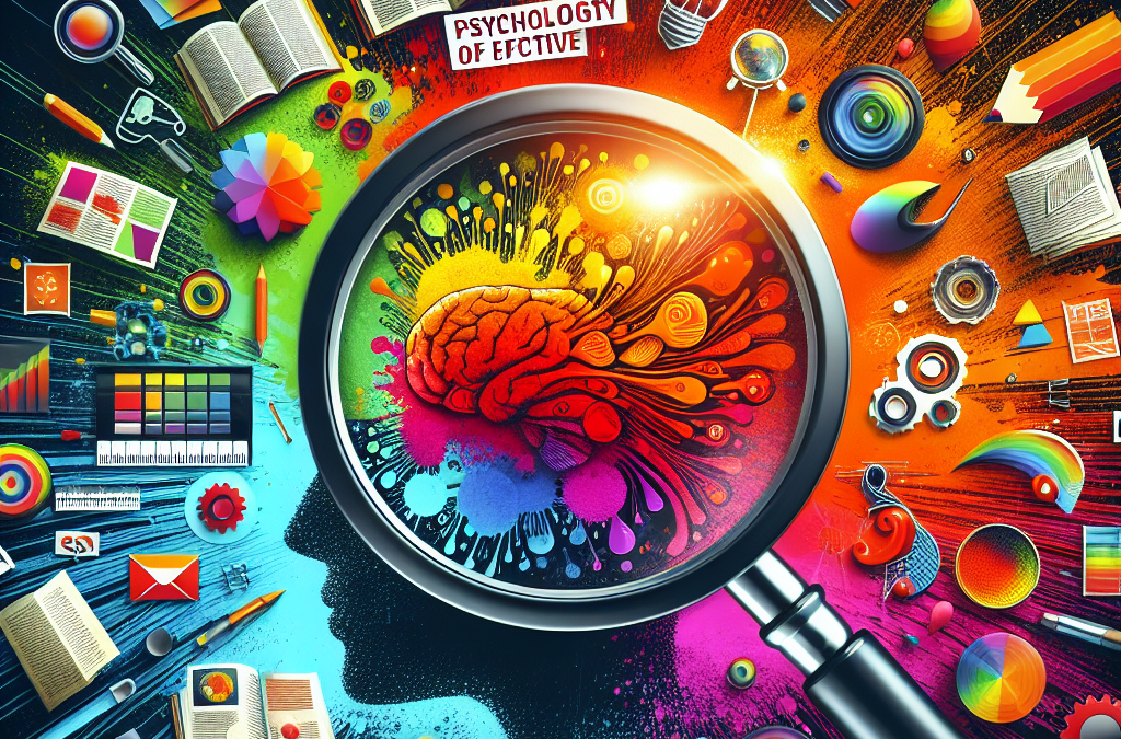
Have you ever been captivated by a print advertisement, unable to tear your eyes away from the page? Or felt a surge of emotion while flipping through the pages of a magazine? If so, you have experienced the power of effective print design. In today’s digital age, where online advertising dominates the marketing landscape, print design may seem like a relic of the past. However, research shows that print advertisements have a unique ability to capture attention and evoke powerful emotions in viewers. In this article, we will delve into the psychology behind effective print design, exploring how designers strategically use visual elements, color, typography, and layout to create compelling and memorable experiences.
Print design is more than just a visual medium; it is a powerful tool for communication. Designers understand that their creations must not only catch the eye but also convey a message and evoke a response. To achieve this, they draw on principles from psychology to tap into the subconscious minds of viewers. By understanding how the human brain processes information and responds to visual stimuli, designers can create print advertisements that not only grab attention but also elicit specific emotions. From the use of bold colors to trigger excitement or urgency, to the careful selection of fonts to convey trustworthiness or elegance, every element of a print design is carefully crafted to make an impact. In this article, we will explore the various psychological techniques employed by designers to create effective print advertisements, and how businesses can harness the power of print to connect with their target audience on a deeper level.
Key Takeaways:
1. Understand the power of visual hierarchy: Effective print design relies on creating a clear visual hierarchy to guide the viewer’s attention. By using size, color, and placement strategically, designers can direct the viewer’s gaze and ensure the most important elements are noticed first.
2. Utilize color psychology: Colors have a profound impact on human emotions and can be used to elicit specific responses from viewers. By understanding the psychological associations of different colors, designers can create print materials that evoke the desired emotional response and enhance the overall message.
3. Incorporate typography for emotional impact: Typography plays a crucial role in print design, as different fonts can convey different emotions. By carefully selecting fonts that align with the intended message, designers can enhance the emotional impact of their print materials and create a stronger connection with the audience.
4. Use imagery to evoke emotions: Images have the power to evoke strong emotions and can greatly enhance the effectiveness of print design. By selecting and placing images strategically, designers can create a visual narrative that resonates with viewers on an emotional level, making the print materials more memorable and impactful.
5. Consider the psychology of space: Negative space, also known as white space, plays a vital role in print design. By allowing elements to breathe and using whitespace strategically, designers can create a sense of balance, clarity, and focus. Understanding the psychology of space helps designers create print materials that are visually appealing and easy to navigate.
The Controversial Aspects of ‘The Psychology of Effective Print Design: Capturing Attention and Emotion’
1. Manipulation of Emotions
One controversial aspect of ‘The Psychology of Effective Print Design: Capturing Attention and Emotion’ is the potential for manipulation of emotions. The article explores how specific design elements, such as color, typography, and imagery, can be strategically used to evoke certain emotional responses from readers. While this approach can be effective in capturing attention and creating a desired emotional impact, some argue that it crosses ethical boundaries by intentionally manipulating individuals’ emotions.
Proponents of this view argue that design should focus on transparency and authenticity, rather than attempting to manipulate readers’ emotions. They believe that design should be responsible for conveying information accurately and honestly, without resorting to emotional manipulation. They argue that by intentionally manipulating emotions, designers risk undermining readers’ trust and credibility.
On the other hand, supporters of the article’s approach argue that emotions play a significant role in communication and persuasion. They believe that by understanding the psychology behind emotional responses, designers can create more engaging and impactful designs. They argue that as long as the emotional manipulation is not deceptive or harmful, it can be a legitimate tool in effective print design.
2. Cultural and Individual Differences
Another controversial aspect of ‘The Psychology of Effective Print Design: Capturing Attention and Emotion’ is the assumption that certain design elements universally evoke specific emotional responses. The article suggests that certain colors, for example, are associated with specific emotions across cultures. However, critics argue that emotions and their associations are highly subjective and can vary significantly among individuals and cultures.
Opponents of the article’s viewpoint argue that design should be sensitive to cultural and individual differences. They believe that relying on generalizations about emotional responses can lead to stereotyping and misinterpretation. They argue that effective print design should consider the diverse perspectives and preferences of the target audience, rather than assuming a one-size-fits-all approach.
Supporters of the article’s viewpoint, on the other hand, argue that while there may be variations in emotional responses, certain design principles can still be effective in capturing attention and evoking emotions. They believe that understanding common emotional associations can provide a useful starting point for designers, who can then adapt their approach based on specific cultural and individual contexts.
3. Ethical Implications in Advertising
The article’s exploration of the psychology of effective print design raises ethical concerns, particularly in the context of advertising. By understanding how design elements can capture attention and evoke emotions, advertisers can potentially exploit these techniques to manipulate consumers and drive sales. Critics argue that this manipulation can be deceptive and unethical, as it may exploit vulnerabilities and lead to impulsive or irrational decision-making.
Opponents of the article’s viewpoint argue that design should prioritize ethical considerations, such as promoting informed decision-making and respecting consumer autonomy. They believe that responsible design should empower individuals rather than manipulate them. They advocate for transparency in advertising, ensuring that design elements are used to enhance understanding rather than deceive consumers.
Supporters of the article’s approach argue that ethical considerations lie not in the design techniques themselves but in how they are employed. They believe that responsible designers should use their understanding of psychology to create persuasive designs that are also transparent and informative. They argue that effective print design can still be ethical by ensuring that the emotional impact aligns with the product or message being communicated, without resorting to deceptive tactics.
‘the psychology of effective print design: capturing attention and emotion’ explores various controversial aspects related to emotional manipulation, cultural differences, and ethical implications in design. while critics argue that emotional manipulation can be unethical and that design should be sensitive to individual and cultural differences, supporters believe that understanding psychology can enhance the impact of print design if used responsibly and transparently. ultimately, finding a balance between capturing attention and evoking emotions while maintaining ethical standards is crucial in the field of effective print design.
The Power of Color Psychology
Color plays a crucial role in print design, as it has the ability to evoke emotions and influence behavior. Understanding the principles of color psychology can help designers create effective print materials that capture attention and elicit desired emotional responses. For example, warm colors like red and orange can create a sense of urgency and excitement, making them ideal for promotional materials. On the other hand, cool colors like blue and green can evoke feelings of calmness and trust, making them suitable for corporate brochures or healthcare-related designs. By strategically using colors that align with the intended message, designers can enhance the impact of their print materials.
The Role of Typography in Print Design
Typography is not just about choosing fonts; it is about creating a visual hierarchy and conveying the intended message effectively. Different fonts have distinct personalities and associations, which can influence how readers perceive the content. Serif fonts, for instance, are often associated with tradition and reliability, while sans-serif fonts convey a modern and clean aesthetic. Moreover, the size, weight, and spacing of the text can also impact the readability and emotional impact of the design. By carefully selecting and arranging typography elements, designers can guide readers’ attention and enhance the overall effectiveness of print materials.
The Science of Visual Hierarchy
Visual hierarchy refers to the arrangement of elements in a design to guide viewers’ attention and convey the intended message effectively. By understanding how the human brain processes visual information, designers can create print materials that capture attention and engage readers. Elements such as size, contrast, and placement can be strategically utilized to emphasize important information and create a clear flow of information. For example, using larger text or bold fonts for headlines can draw attention, while contrasting colors can make certain elements stand out. By employing principles of visual hierarchy, designers can ensure that their print materials are visually appealing and easy to navigate.
The Impact of Imagery and Visuals
Incorporating compelling imagery and visuals is essential in print design to evoke emotions and create a lasting impression. Humans are visual creatures, and our brains respond strongly to images. By selecting the right images that align with the intended message, designers can enhance the emotional impact of their print materials. For example, using images of happy people in a healthcare brochure can evoke a sense of trust and well-being. Additionally, the composition, color, and style of the visuals can also influence how viewers perceive the design. By leveraging the power of imagery, designers can create print materials that resonate with their target audience.
The Role of White Space and Simplicity
White space, also known as negative space, is the empty space between design elements. It plays a crucial role in print design by providing visual breathing room and enhancing the overall aesthetics. By strategically incorporating white space, designers can create a sense of balance and clarity in their designs. Simplicity is also key in effective print design, as it allows the message to be easily understood and remembered. By eliminating unnecessary clutter and focusing on the essential elements, designers can ensure that their print materials are visually appealing and easy to comprehend. The use of white space and simplicity can help capture attention and convey the desired emotional response.
Understanding Cognitive Biases in Print Design
Cognitive biases are inherent tendencies of the human brain to think and make decisions in certain ways. By understanding these biases, designers can create print materials that effectively influence readers’ perceptions and behaviors. For example, the anchoring bias suggests that people tend to rely heavily on the first piece of information they encounter. Designers can utilize this bias by strategically placing important information at the beginning of a brochure or advertisement. Other biases, such as the framing effect or the scarcity effect, can also be leveraged to create persuasive print designs. By tapping into cognitive biases, designers can maximize the impact of their print materials.
The Role of Emotional Appeal in Print Design
Emotions play a significant role in decision-making, and print design has the power to evoke specific emotional responses. By understanding the target audience and their emotional triggers, designers can create print materials that resonate with readers on a deeper level. For example, a travel brochure can use vibrant colors and captivating imagery to evoke a sense of adventure and wanderlust. Similarly, a charity appeal can use poignant visuals and compelling narratives to elicit empathy and compassion. By appealing to readers’ emotions, print designs can leave a lasting impression and drive desired actions.
The Importance of Consistency and Branding
Consistency is key in effective print design, as it helps establish a strong brand identity and reinforces brand recognition. By using consistent colors, typography, and visual elements across different print materials, designers can create a cohesive and recognizable brand image. Consistency also extends to the tone and messaging of the content. By maintaining a consistent voice and style, print materials can build trust and familiarity with the audience. Effective branding ensures that print designs capture attention, evoke emotions, and leave a lasting impact.
Testing and Iteration for Optimal Results
Designing effective print materials is an iterative process that requires testing and refinement. By conducting user testing and gathering feedback, designers can identify areas for improvement and make necessary adjustments. A/B testing can help determine the most effective color schemes, typography choices, and layouts. Eye-tracking studies can provide insights into how viewers interact with the design and where their attention is drawn. By continuously refining and optimizing print designs based on data and user feedback, designers can maximize their impact and create materials that effectively capture attention and evoke desired emotions.
The Historical Context of ‘The Psychology of Effective Print Design: Capturing Attention and Emotion’
Effective print design has always been an essential aspect of communication, and its evolution over time has been influenced by various historical factors. From the early days of print media to the modern digital age, designers have continuously sought to capture attention and evoke emotion through their creations. This article examines the historical context of ‘The Psychology of Effective Print Design: Capturing Attention and Emotion’ and how it has evolved to its current state.
The Early Days of Print Media
In the early days of print media, which can be traced back to the invention of the printing press by Johannes Gutenberg in the 15th century, the primary focus was on disseminating information. The design elements were limited, with typography and layout serving a functional purpose rather than being driven by psychological considerations. The main goal was to convey information accurately and efficiently.
However, as print media became more widespread and competitive, designers started to recognize the importance of capturing the attention of readers. They began experimenting with different typefaces, sizes, and layouts to make their publications visually appealing. This marked the beginning of the psychological aspect of print design, as designers started to understand the impact of visual elements on reader engagement.
The Rise of Advertising and Consumer Culture
In the late 19th and early 20th centuries, the rise of advertising and consumer culture brought about a significant shift in print design. Advertisers realized that capturing attention was crucial for promoting products and services effectively. This led to the emergence of persuasive techniques and the use of emotional appeals in print advertisements.
Designers started incorporating elements such as vibrant colors, eye-catching imagery, and compelling headlines to grab the audience’s attention. They understood that emotions played a vital role in influencing consumer behavior, and print design became a powerful tool for creating desire and driving sales.
The Influence of Art and Design Movements
Throughout the 20th century, various art and design movements influenced the evolution of print design. Movements such as Art Nouveau, Bauhaus, and Art Deco brought new aesthetics and design principles to the forefront. Designers began to explore the use of symmetry, balance, and visual hierarchy to create impactful compositions.
These movements also emphasized the importance of psychology in design. Designers started to consider how color, form, and typography could evoke specific emotions and convey messages effectively. They experimented with different visual techniques to capture attention and create a lasting impression on the audience.
The Digital Revolution and Beyond
The advent of the digital revolution in the late 20th century brought about a paradigm shift in print design. With the rise of computers and digital software, designers gained access to a wide range of tools and techniques that allowed for more sophisticated and dynamic designs.
Print design evolved beyond static layouts, incorporating interactive elements, animations, and multimedia. The focus shifted from capturing attention to creating immersive and engaging experiences. Designers started to leverage user experience (UX) principles and understand the cognitive aspects of design to optimize the effectiveness of their creations.
Today, print design exists in a dynamic landscape where traditional print media coexists with digital platforms. Designers have a vast array of tools and technologies at their disposal, enabling them to create visually stunning and psychologically impactful designs. The psychology of effective print design continues to evolve as designers adapt to the changing needs and preferences of their audience.
FAQs
1. How does print design impact attention and emotion?
Print design plays a crucial role in capturing attention and evoking emotions. Through the use of color, typography, imagery, and layout, print design can create a visual hierarchy that guides the viewer’s attention and triggers emotional responses.
2. What role does color play in print design?
Color is a powerful tool in print design. Different colors evoke different emotions and can influence how a design is perceived. Warm colors like red and orange can create a sense of energy and excitement, while cool colors like blue and green can evoke calmness and tranquility.
3. How does typography impact the effectiveness of print design?
Typography sets the tone and personality of a design. The choice of fonts, font sizes, and spacing can influence how the message is perceived. For example, bold and large fonts can convey a sense of strength and importance, while elegant and script fonts can create a feeling of sophistication.
4. Can imagery enhance the emotional impact of print design?
Absolutely. Images have the power to evoke emotions and create a connection with the viewer. Carefully selected and well-placed images can enhance the message of a design and make it more relatable and memorable.
5. How does the layout of a print design affect attention?
The layout of a print design determines the flow of information and guides the viewer’s attention. Strategic placement of elements, such as headlines, subheadings, and call-to-action buttons, can help direct the reader’s focus and ensure important information is not overlooked.
6. What role does white space play in print design?
White space, also known as negative space, is the empty space between elements in a design. It helps create visual balance, improve readability, and highlight key elements. By incorporating white space effectively, print designs can enhance attention and make the content more digestible.
7. How can print design create a sense of urgency?
Print design can create a sense of urgency through various techniques. The use of bold colors, strong typography, and compelling imagery can grab attention and convey a sense of immediacy. Additionally, incorporating time-limited offers or limited edition labels can further enhance the perceived urgency.
8. What are some psychological principles that can be applied to print design?
Several psychological principles can be applied to print design to capture attention and evoke emotions. These include the use of contrast to create visual interest, the rule of thirds to create balanced compositions, and the concept of gestalt to create unity and coherence in the design.
9. How can print design appeal to different target audiences?
Understanding the target audience is crucial in designing effective print materials. By conducting research and analyzing the preferences and characteristics of the target audience, designers can tailor the color schemes, typography, imagery, and overall design style to resonate with their specific demographic.
10. Can print design influence purchasing decisions?
Yes, print design can have a significant impact on purchasing decisions. When a design effectively captures attention, evokes emotions, and communicates the benefits of a product or service, it can influence consumers’ perceptions and increase the likelihood of making a purchase.
The Role of Color in Print Design
Color plays a crucial role in print design as it has the power to evoke emotions and capture attention. Different colors can have varying effects on our mood and perception, and understanding this can help designers create effective visual communication.
When it comes to print design, warm colors like red, orange, and yellow tend to grab attention and create a sense of energy and excitement. These colors are often used to highlight important information or call-to-action elements in advertisements or posters.
On the other hand, cool colors like blue, green, and purple have a calming effect and can create a sense of trust and reliability. These colors are often used in corporate branding or to convey a sense of professionalism and stability.
Additionally, the use of complementary colors can create visual harmony and balance in print design. Complementary colors are opposite each other on the color wheel, such as blue and orange or red and green. When used together, they create a strong contrast that can make certain elements stand out.
It’s important for designers to consider the target audience and the message they want to convey when choosing colors for print design. By understanding the psychological impact of different colors, designers can create visually appealing and emotionally engaging designs.
The Power of Typography in Print Design
Typography refers to the style, arrangement, and appearance of text in print design. It may seem like a simple aspect, but typography has a significant impact on how readers perceive and engage with printed materials.
One important aspect of typography is legibility. The chosen font should be easy to read, especially when it comes to body text. Sans-serif fonts like Arial or Helvetica are often preferred for body text as they are clean and straightforward. On the other hand, decorative or script fonts may be used sparingly for headlines or titles to add visual interest.
The size of the text also plays a role in print design. Headlines or titles are usually larger to grab attention, while body text is smaller for easy reading. The spacing between letters and lines, known as kerning and leading, respectively, also affects legibility. Proper spacing ensures that the text is clear and not cramped.
Typography also helps convey the tone and personality of the printed material. Bold or italicized text can emphasize important information or add emphasis to certain words. Different fonts have different connotations, such as serif fonts being associated with tradition and elegance, while sans-serif fonts are seen as modern and clean.
By carefully selecting and arranging typography, designers can enhance the overall visual impact of print materials and effectively communicate their message.
The Role of Visual Hierarchy in Print Design
Visual hierarchy refers to the arrangement and organization of elements in a design to guide the viewer’s attention and convey the importance of different information. It helps create a clear and logical flow of information, making it easier for readers to navigate and understand the content.
One way to establish visual hierarchy is through the use of size and scale. Larger elements tend to grab attention first, so important information or key messages can be emphasized by increasing their size. For example, a headline may be larger than the body text to make it stand out.
Contrast is another important aspect of visual hierarchy. By using contrasting colors, fonts, or shapes, designers can create a clear distinction between different elements. This contrast helps direct the viewer’s attention to specific areas of the design.
Placement and alignment also contribute to visual hierarchy. Important information is often positioned at the top or in the center of the design, as these areas naturally attract attention. Alignment creates a sense of order and makes it easier for the viewer to follow the flow of information.
Finally, the use of white space, or empty space, is essential in print design. White space helps create a sense of balance and allows the viewer’s eyes to rest. It also helps separate different elements, making the design more organized and visually appealing.
By understanding and implementing visual hierarchy, designers can effectively guide the viewer’s attention and create visually appealing and easy-to-understand print materials.
Conclusion
Understanding the psychology behind effective print design is crucial for capturing attention and evoking emotion in readers. By utilizing the principles of visual hierarchy, color psychology, and typography, designers can create visually appealing and impactful print materials.
Firstly, visual hierarchy plays a vital role in guiding the reader’s eye and prioritizing information. By using size, color, and placement, designers can direct attention to the most important elements and create a clear and organized visual flow. Additionally, color psychology demonstrates the power of colors in influencing emotions and perceptions. Choosing the right color palette can evoke specific feelings and associations, enhancing the overall impact of the design. Lastly, typography plays a significant role in conveying the tone and message of the print material. Selecting appropriate fonts, sizes, and styles can elicit emotions and enhance readability.
Overall, by incorporating these psychological principles into print design, designers can create materials that not only capture attention but also resonate with readers on an emotional level. Understanding the psychology behind effective print design is a valuable skill that can greatly enhance the effectiveness and impact of any print material.