Unleashing the Power of Print: Mastering the Principles of Design to Captivate and Engage
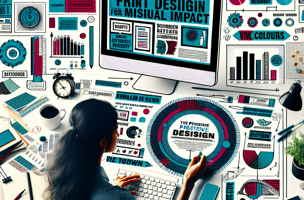
When it comes to print design, first impressions matter. In a world saturated with visual stimuli, it is crucial for designers to create eye-catching and impactful designs that capture the attention of their audience. Whether it’s a magazine spread, a brochure, or a poster, effective print design can make all the difference in conveying a message and leaving a lasting impression. In this article, we will explore the principles of effective print design that can help designers maximize visual impact and create designs that truly stand out.
From the strategic use of color and typography to the careful arrangement of elements on a page, effective print design requires a thoughtful approach. We will delve into the importance of choosing the right color palette and how it can evoke specific emotions and enhance the overall message of a design. Additionally, we will discuss the power of typography and how selecting the appropriate fonts can greatly impact the readability and visual appeal of a printed piece. Furthermore, we will explore the concept of visual hierarchy and how it can guide the viewer’s attention to the most important elements of a design. By understanding these principles and implementing them effectively, designers can create print designs that not only catch the eye but also effectively communicate the intended message.
Key Takeaways:
1. Understand the importance of visual hierarchy: When designing a print piece, it is crucial to establish a clear visual hierarchy to guide the reader’s eye and communicate the most important information effectively. This can be achieved through variations in font size, color, and spacing.
2. Utilize whitespace strategically: Whitespace, or negative space, is essential in print design as it helps create balance, emphasize key elements, and improve readability. By allowing elements to breathe, you can enhance the overall visual impact of your design.
3. Choose fonts wisely: Selecting the right fonts can significantly impact the visual appeal of your print design. It is important to consider legibility, readability, and the overall tone and message of your piece. Combining different font styles can also add interest and hierarchy to your design.
4. Use color effectively: Color plays a vital role in print design, evoking emotions and conveying messages. Understanding color theory and using a well-thought-out color scheme can enhance the visual impact of your design and create a cohesive and visually appealing piece.
5. Pay attention to details: The small details in print design can make a big difference in the overall visual impact. This includes paying attention to alignment, consistency in design elements, and ensuring high-quality images and graphics. Attention to detail can elevate the professionalism and effectiveness of your print design.
The Use of Bold Colors
The first controversial aspect of ‘The Principles of Effective Print Design for Maximum Visual Impact’ is the use of bold colors. The principle suggests that using vibrant and eye-catching colors can help grab the reader’s attention and make the design more visually appealing. However, some critics argue that this approach may be too overwhelming and distracting for the readers.
Proponents of bold colors argue that they can help create a strong visual hierarchy and guide the reader’s eyes to important elements of the design. They believe that using bold colors strategically can enhance the overall impact of the print material. Additionally, bold colors can evoke certain emotions and convey a specific message or brand identity.
On the other hand, critics argue that excessive use of bold colors can make the design look unprofessional and cluttered. They believe that it may be challenging for readers to focus on the content when the colors are too overpowering. Moreover, some individuals may find certain bold colors visually unpleasant or even triggering.
The Inclusion of Complex Typography
Another controversial aspect of the principles is the inclusion of complex typography. The principle suggests that using a variety of fonts and typographic styles can add visual interest and help convey the intended message effectively. However, critics argue that this approach may lead to confusion and make the design difficult to read and comprehend.
Supporters of complex typography argue that it can help create a unique and memorable design. They believe that combining different fonts and typographic elements can add depth and personality to the print material. Additionally, using typography creatively can help emphasize certain words or phrases, enhancing the overall impact of the design.
Opponents of complex typography argue that it can hinder readability, especially for individuals with visual impairments or those who struggle with reading comprehension. They argue that simplicity and clarity should be prioritized over visual aesthetics. Moreover, using too many different fonts and styles may create a chaotic and inconsistent design.
The Integration of Controversial Imagery
The integration of controversial imagery is yet another aspect of the principles that sparks debate. The principle suggests that using provocative or controversial imagery can capture the reader’s attention and create a strong emotional response. However, critics argue that this approach may alienate certain audiences and be perceived as offensive or insensitive.
Advocates for controversial imagery argue that it can be a powerful tool for sparking discussions and raising awareness about important issues. They believe that using thought-provoking imagery can make the design more memorable and impactful. Additionally, controversial imagery can challenge societal norms and encourage critical thinking.
Opponents of controversial imagery argue that it can be alienating and may overshadow the intended message of the print material. They believe that using imagery that is offensive or triggering can create a negative association with the brand or organization. Moreover, some individuals may find certain controversial imagery distressing or inappropriate.
The Importance of Typography in Print Design
Typography plays a crucial role in print design, as it not only conveys the message but also adds visual appeal to the overall layout. Choosing the right typeface, font size, and spacing can greatly impact the readability and aesthetics of a printed piece. For example, a clean and legible typeface like Helvetica is often used for professional and corporate designs, while a decorative font like Lobster may be more suitable for a creative and artistic project. Additionally, the appropriate use of font sizes and spacing can help guide the reader’s eye and create a hierarchy of information. By carefully considering typography, designers can ensure that their print materials are visually appealing and effectively communicate the intended message.
The Role of Color in Print Design
Color is a powerful tool in print design that can evoke emotions, convey meaning, and create visual impact. When used effectively, color can enhance the overall design and draw attention to key elements. For instance, contrasting colors can be used to highlight important information or create visual interest. Additionally, color schemes can be chosen to reflect the brand identity or the desired mood of the piece. For example, warm colors like red and orange can evoke feelings of excitement and energy, while cool colors like blue and green can create a sense of calm and tranquility. By understanding color theory and using it strategically, designers can create visually compelling print materials that leave a lasting impression on the audience.
The Balance of Elements in Print Design
Balance is a fundamental principle of design that ensures visual harmony and coherence. In print design, balance can be achieved through the careful arrangement of elements such as text, images, and white space. There are two types of balance: symmetrical and asymmetrical. Symmetrical balance involves arranging elements in a way that is evenly distributed and creates a sense of stability. On the other hand, asymmetrical balance involves arranging elements in an uneven manner to create visual interest and dynamic tension. By understanding the principles of balance, designers can create visually pleasing and well-structured print designs that engage the audience.
The Effective Use of Images in Print Design
Images are a powerful tool in print design that can convey messages, evoke emotions, and capture attention. When selecting and using images, it is important to consider their quality, relevance, and placement within the design. High-resolution images that are clear and well-lit will enhance the overall visual impact of the print material. Additionally, choosing images that are relevant to the content and target audience will help create a stronger connection and engagement. The placement of images within the layout should also be carefully considered to ensure they complement the text and other design elements. By effectively incorporating images into print design, designers can create visually compelling materials that resonate with the audience.
The Role of Layout and Composition in Print Design
The layout and composition of a print design are crucial in determining its visual impact and readability. A well-designed layout guides the reader’s eye through the content and helps prioritize information. The use of grids, columns, and alignment can create a sense of order and structure, making the piece easier to navigate. Additionally, the careful placement of text, images, and other design elements can create visual interest and hierarchy. For example, using white space strategically can help highlight key elements and improve readability. By paying attention to layout and composition, designers can create print materials that are visually appealing, easy to read, and effectively communicate the intended message.
The Importance of Consistency and Branding in Print Design
Consistency and branding are essential in print design to create a cohesive and recognizable identity. By using consistent typography, color schemes, and design elements, designers can establish a visual language that reflects the brand and ensures recognition across different print materials. Consistency also helps create a sense of professionalism and reliability, as it shows attention to detail and a unified message. Additionally, incorporating branding elements such as logos and taglines reinforces brand identity and helps build brand awareness. By prioritizing consistency and branding in print design, designers can create materials that leave a lasting impression and strengthen the brand’s image.
The Role of Contrast and Hierarchy in Print Design
Contrast and hierarchy are essential principles in print design that help create visual impact and guide the reader’s attention. Contrast refers to the juxtaposition of different elements, such as color, size, and shape, to create visual interest and emphasize important information. For example, using a bold font for headings and a lighter font for body text creates contrast and helps establish a hierarchy of information. Hierarchy, on the other hand, involves organizing elements in a way that communicates their relative importance. This can be achieved through the use of font size, weight, and placement. By effectively using contrast and hierarchy, designers can create print materials that are visually engaging and easy to navigate.
The Importance of White Space in Print Design
White space, also known as negative space, is the area of a design that is left empty. While it may seem counterintuitive, white space is a crucial element in print design that helps improve readability, highlight key elements, and create visual balance. By allowing elements to breathe and giving them room to stand out, white space enhances the overall visual impact of the design. It also helps reduce clutter and makes the piece more visually appealing. Additionally, white space can be used strategically to create a sense of elegance and sophistication. By embracing the power of white space, designers can create print materials that are visually impactful and effectively communicate the intended message.
The Role of Paper and Printing Techniques in Print Design
The choice of paper and printing techniques can greatly impact the visual appeal and tactile experience of a print design. Different paper stocks and finishes can create different effects, such as a glossy or matte finish, textured surfaces, or metallic accents. By selecting the right paper and finish, designers can enhance the overall look and feel of the printed piece. Similarly, printing techniques like embossing, foil stamping, or spot UV coating can add depth, texture, and visual interest to the design. By understanding the possibilities offered by different paper and printing techniques, designers can create print materials that stand out and leave a lasting impression on the audience.
The Importance of Testing and Iteration in Print Design
Testing and iteration are crucial steps in the print design process to ensure that the final product meets the intended goals and resonates with the target audience. By conducting user testing or gathering feedback from stakeholders, designers can identify areas for improvement and make necessary adjustments. This can include refining the layout, typography, color scheme, or any other design element. Additionally, testing different variations of the design can help determine which version is most effective in terms of visual impact and message communication. By embracing a process of testing and iteration, designers can create print materials that are visually compelling, engaging, and resonate with the audience.
The Historical Context of ‘The Principles of Effective Print Design for Maximum Visual Impact’
Effective print design has always been a crucial aspect of communication throughout history. From ancient manuscripts to modern-day magazines, the principles of visual impact have evolved over time to adapt to changing technologies and societal norms. This article examines the historical context of these principles and how they have shaped the current state of print design.
1. Ancient Manuscripts and Illuminated Texts
In the early days of print design, before the invention of the printing press, manuscripts were meticulously crafted by hand. Illuminated texts, such as medieval manuscripts, showcased intricate designs and embellishments to captivate the reader’s attention. The use of vibrant colors, ornate borders, and elaborate illustrations aimed to engage the viewer and enhance the visual impact of the text.
2. The Gutenberg Revolution
The invention of the printing press by Johannes Gutenberg in the 15th century revolutionized the world of print design. With the ability to mass-produce books, new principles emerged to ensure maximum visual impact. Typography became a key element, with the development of typefaces and the arrangement of text in columns and paragraphs. Clear and legible fonts were chosen to enhance readability, making printed materials more accessible to a wider audience.
3. The Birth of Advertising
As printing technology advanced, the concept of advertising began to take shape. In the 18th and 19th centuries, newspapers and magazines became popular mediums for promoting products and services. Eye-catching visuals, bold headlines, and persuasive copywriting were employed to grab the attention of readers and entice them to make purchases. This era marked the birth of the principles of effective advertising design, which continue to influence print design today.
4. The Rise of Graphic Design
In the early 20th century, graphic design emerged as a distinct discipline within print design. Artists and designers such as Bauhaus pioneers Herbert Bayer and Jan Tschichold revolutionized the field with their minimalist and functional approach. The principles of effective print design shifted towards simplicity, clarity, and hierarchy. Grid systems were introduced to create visual order, and the use of white space became essential in guiding the viewer’s eye.
5. The Digital Age
The advent of computers and digital technology in the late 20th century brought about a new era in print design. With the rise of desktop publishing software, designers gained unprecedented control over layout, typography, and color. The principles of effective print design evolved to incorporate digital aesthetics, such as pixel-perfect graphics, seamless integration of text and images, and interactive elements.
6. Contemporary Trends
Today, print design continues to evolve in response to changing trends and technologies. Minimalism, bold typography, and vibrant colors are popular choices for maximum visual impact. Designers also consider the importance of sustainability, using eco-friendly materials and techniques. Additionally, the rise of mobile devices has led to a focus on responsive design, ensuring that print materials can be easily viewed and interacted with on different screens.
The principles of effective print design have a rich historical context that spans centuries. From ancient illuminated texts to the digital age, designers have continually adapted their approaches to maximize visual impact. By understanding this historical evolution, designers can create print materials that effectively communicate and engage with their intended audience.
Color Theory and Contrast
Color plays a crucial role in print design, as it can evoke emotions, convey messages, and create visual interest. Understanding color theory and using contrast effectively can greatly enhance the visual impact of a design.
When selecting colors for a print design, it is important to consider the color wheel and its relationships. Complementary colors, which are opposite each other on the color wheel, create a strong contrast and can be used to make elements stand out. Analogous colors, which are adjacent on the color wheel, create a harmonious and cohesive look.
Contrast can be achieved through variations in hue, saturation, and brightness. Using a combination of light and dark colors can create a strong contrast, making important elements pop. Additionally, contrasting warm and cool colors can add visual interest and depth to a design.
Another important aspect of color theory is understanding the psychological effects of different colors. For example, warm colors like red and orange can evoke feelings of excitement and energy, while cool colors like blue and green can create a sense of calmness and tranquility. By understanding these effects, designers can choose colors that align with the intended message and emotions of the design.
Typography and Readability
Typography plays a vital role in print design, as it affects the readability and overall visual appeal of the content. Choosing the right typeface, font size, and spacing is crucial for maximum impact.
When selecting a typeface, it is important to consider the purpose and tone of the design. Serif fonts, with their decorative strokes, are often used for traditional and formal designs, while sans-serif fonts are more modern and clean. Display fonts can add personality and uniqueness to a design, but should be used sparingly and for specific purposes.
Font size is another important consideration. It is essential to ensure that the text is legible and easy to read, especially from a typical reading distance. Headlines and titles should be larger and bolder to grab attention, while body text should be smaller and optimized for readability.
Spacing, both between letters (kerning) and between lines (leading), also plays a significant role in readability. Proper kerning ensures that letters are evenly spaced and do not appear cramped or too far apart. Leading, on the other hand, determines the vertical space between lines of text. Sufficient leading helps improve readability, especially for longer paragraphs.
Layout and Visual Hierarchy
The layout of a print design determines how information is organized and presented, and visual hierarchy helps guide the viewer’s attention and understanding of the content.
Grid-based layouts are commonly used in print design to create a sense of order and consistency. By dividing the design into columns and rows, designers can align elements and create a balanced composition. Grids also help establish a visual hierarchy by defining areas for headlines, body text, images, and other elements.
Visual hierarchy is achieved through the strategic use of size, color, contrast, and positioning. Important elements should be larger, bolder, or placed in prominent positions to attract attention. Headlines and subheadings can be used to break up the content and guide the reader through the design.
Whitespace, or negative space, is another crucial aspect of layout. It refers to the empty space between elements and helps create a sense of balance and clarity. Proper use of whitespace can enhance the overall visual impact of a design by allowing important elements to stand out and reducing visual clutter.
Images and Visual Elements
Images and visual elements are powerful tools in print design for conveying messages, evoking emotions, and adding visual interest.
When selecting images, it is important to consider their relevance to the content and the overall design concept. High-quality, high-resolution images are essential for print as they ensure clarity and sharpness. Additionally, images should be properly sized and positioned to fit within the layout without overpowering other elements.
Visual elements such as icons, illustrations, and infographics can also enhance the visual impact of a design. They can be used to represent concepts, break up text-heavy content, or add a touch of creativity. Consistency in style and color palette is important when using visual elements to maintain a cohesive look.
Lastly, it is important to consider the printing process when working with images and visual elements. Understanding color profiles, resolution requirements, and file formats ensures that the final printed design accurately represents the intended visual impact.
Case Study 1: Coca-Cola’s “Share a Coke” Campaign
One of the most successful print design campaigns in recent years is Coca-Cola’s “Share a Coke” campaign. The campaign aimed to connect with consumers on a personal level by printing individual names on Coca-Cola bottles and cans. This simple yet effective design strategy created a visual impact that resonated with consumers around the world.
The key principle of effective print design demonstrated in this case study is the use of personalization to create a strong emotional connection with the audience. By printing individual names on the bottles, Coca-Cola made consumers feel special and unique. This personal touch not only increased brand loyalty but also encouraged people to share their personalized Coca-Cola bottles on social media, generating further buzz and word-of-mouth marketing.
Case Study 2: Apple’s Product Packaging
Apple is known for its sleek and minimalist product designs, and this extends to their packaging as well. The company understands the importance of visual impact in print design and uses it to create a premium and luxurious brand image.
The key principle demonstrated in this case study is the use of simplicity and elegance in print design. Apple’s product packaging is clean, uncluttered, and often features high-quality product images. The use of minimal text and focus on visual elements allows the product to take center stage, creating a strong visual impact and conveying a sense of sophistication and quality.
Additionally, Apple pays attention to every detail, from the choice of materials to the typography used on the packaging. This attention to detail further enhances the visual impact and reinforces the brand’s commitment to excellence.
Case Study 3: National Geographic Magazine
National Geographic Magazine is known for its stunning photography and captivating visual storytelling. The magazine’s print design principles have played a significant role in its success and longevity.
The key principle demonstrated in this case study is the use of compelling visuals to engage and captivate the audience. National Geographic’s print design focuses on showcasing breathtaking photography, often featuring full-page or double-page spreads. The use of vibrant colors, high-resolution images, and strategic placement of visuals creates a visual impact that draws readers in and encourages them to explore the content further.
In addition to visuals, National Geographic also employs effective typography and layout design to enhance the overall reading experience. The use of clear and legible fonts, appropriate text sizes, and well-organized layouts ensure that the content is easily digestible and visually appealing.
These case studies highlight the effectiveness of different print design principles in creating maximum visual impact. whether it’s personalization, simplicity and elegance, or compelling visuals, the key is to understand the target audience and design with their preferences and emotions in mind. by implementing these principles, brands can create print designs that not only catch the eye but also leave a lasting impression on the audience.
FAQs
1. What are the key principles of effective print design?
The key principles of effective print design include simplicity, balance, hierarchy, contrast, alignment, and consistency. These principles help create visually appealing and easy-to-read designs that effectively communicate the intended message.
2. How can simplicity enhance the visual impact of print design?
Simplicity in print design involves using minimal elements and avoiding clutter. By simplifying the design, you can create a clear and focused message that is more likely to resonate with the audience. Simple designs are also easier to understand and remember.
3. What is the importance of balance in print design?
Balance refers to the distribution of visual elements within a design. It helps create a sense of stability and harmony. By achieving a balanced composition, you can ensure that the design doesn’t feel lopsided or overwhelming, which can distract the viewer from the intended message.
4. How does hierarchy contribute to the effectiveness of print design?
Hierarchy in print design involves organizing information in a way that guides the viewer’s attention. By using different font sizes, colors, and placement, you can prioritize and emphasize important elements. This helps the viewer navigate the design and understand the intended message more easily.
5. What role does contrast play in print design?
Contrast refers to the difference between elements in a design. It helps create visual interest and makes important elements stand out. By using contrasting colors, sizes, or shapes, you can draw attention to key information and enhance the overall visual impact of the design.
6. Why is alignment important in print design?
Alignment refers to the positioning of elements in relation to each other. It helps create a sense of order and organization. By aligning elements, you can make the design look more polished and professional. Proper alignment also improves readability and makes the design more visually appealing.
7. How does consistency contribute to the visual impact of print design?
Consistency in print design involves using the same style, colors, fonts, and layout throughout the design. It helps create a cohesive and unified look. Consistency makes the design more visually appealing and easier to understand, as the viewer can quickly recognize and navigate through the design elements.
8. What are some common mistakes to avoid in print design?
Some common mistakes to avoid in print design include using too many fonts or colors, overcrowding the design with excessive information, neglecting proper alignment, and ignoring the importance of white space. These mistakes can make the design look cluttered, confusing, and unprofessional.
9. How can I create a visually impactful print design on a limited budget?
Creating a visually impactful print design on a limited budget is possible by focusing on the key principles of effective design. Simplify the design, use a limited color palette, and choose fonts that are readily available. Utilize free or low-cost design software and resources. Additionally, consider working with a professional designer who can provide guidance and expertise within your budget.
10. How can I measure the effectiveness of my print design?
Measuring the effectiveness of print design can be done through various methods. You can conduct surveys or interviews to gather feedback from the target audience. Track the response rate or engagement level of the printed materials. Analyze sales or conversion data to assess the impact of the design. Additionally, consider using A/B testing to compare different versions of the design and determine which one performs better.
Common Misconceptions about ‘The Principles of Effective Print Design for Maximum Visual Impact’
Misconception 1: More is better
One common misconception about effective print design is that adding more elements, such as images, colors, and text, will make the design more visually appealing. However, this is not necessarily true. In fact, cluttering a design with too many elements can overwhelm the viewer and make it difficult for them to focus on the main message.
The key principle to remember is simplicity. A clean and uncluttered design allows the viewer to easily understand the message and navigate through the information presented. It is important to prioritize the most important elements and remove any unnecessary distractions. By doing so, the design will have a stronger visual impact and effectively communicate the intended message.
Misconception 2: Fancy fonts make a design more attractive
Another misconception is that using fancy or decorative fonts will make a design more visually appealing. While unique fonts can add personality to a design, it is crucial to consider readability and legibility. The primary goal of any print design is to communicate information clearly and effectively.
Choosing a font that is difficult to read or too elaborate can hinder the viewer’s ability to understand the message. It is important to select fonts that are easy to read, even at smaller sizes. Sans-serif fonts, such as Arial or Helvetica, are often preferred for body text due to their clean and simple appearance. Decorative fonts can be used sparingly for headings or emphasis, but they should not compromise readability.
Misconception 3: Colorful designs are always more attention-grabbing
Many people believe that using a wide range of colors in a design will automatically make it more eye-catching. While color can certainly enhance the visual impact of a design, it is important to use it strategically and purposefully.
The key principle to keep in mind is color harmony. Using too many colors or using colors that clash can result in a chaotic and unappealing design. It is important to select a color palette that complements the message and the overall tone of the design. A well-thought-out color scheme can create visual interest and guide the viewer’s attention to key elements.
Additionally, it is essential to consider the psychological impact of colors. Different colors evoke different emotions and associations. For example, warm colors like red and orange can create a sense of energy and excitement, while cool colors like blue and green can convey calmness and tranquility. By understanding the psychological effects of colors, designers can effectively use them to communicate the desired message.
Effective print design is not about adding more elements, using fancy fonts, or using a multitude of colors. It is about creating a visually appealing and well-organized design that effectively communicates the intended message. By understanding and applying the principles of simplicity, readability, and color harmony, designers can maximize the visual impact of their print designs and engage their audience more effectively.
Concept 1: Contrast
Contrast is a fundamental principle in print design that involves using differences in color, size, shape, and texture to create visual interest and make important elements stand out. By using contrasting elements, designers can create a sense of hierarchy and guide the viewer’s attention to specific areas of a design.
For example, imagine a poster with a dark background and bright, bold text. The contrast between the dark background and the vibrant text immediately catches your eye and makes the text more readable and impactful. Similarly, using contrasting colors for headings and body text helps differentiate between different levels of information and improves readability.
When applying contrast, it’s important to strike a balance. Too much contrast can be overwhelming and make a design appear chaotic, while too little contrast can make it difficult to distinguish between different elements. Designers need to carefully consider the purpose of their design and use contrast strategically to enhance visual impact.
Concept 2: Alignment
Alignment is another key principle in print design that involves positioning elements in a way that creates a sense of order and organization. By aligning elements along a common axis or edge, designers can create a cohesive and visually pleasing layout.
Imagine a magazine spread with text and images scattered randomly across the page. It would be challenging to read and understand the content. However, by aligning the text and images along a grid or using a consistent margin, the design becomes more structured and easier to follow.
Alignment also helps create a sense of unity and balance. For instance, aligning text to the left or right margin and leaving equal spacing between paragraphs creates a clean and organized look. Similarly, aligning images or objects with each other or with the text helps establish relationships between different elements in a design.
When aligning elements, designers should consider the overall composition and the purpose of the design. Aligning elements in a way that supports the intended message or story can significantly enhance the visual impact and readability of a design.
Concept 3: White Space
White space, also known as negative space, is the empty space between and around elements in a design. While it may seem counterintuitive, white space is a powerful tool in print design that can greatly enhance visual impact.
White space provides breathing room for the eyes and helps create a sense of balance and clarity. It allows important elements to stand out and makes the design feel less cluttered. Just as silence in music enhances the impact of individual notes, white space in design allows the viewer to focus on the essential elements.
For example, think of a minimalist poster with a single image in the center and a large amount of empty space around it. The simplicity and spaciousness of the design draw attention to the image and convey a sense of elegance and sophistication.
When using white space, designers should be intentional and strategic. Leaving too much white space can make a design feel empty or unfinished, while too little can make it appear crowded and overwhelming. Finding the right balance between elements and white space is crucial to maximizing visual impact.
1. Understand the importance of hierarchy
When designing any print material, it’s crucial to establish a clear hierarchy of information. Determine what elements are most important and make them stand out. Use larger font sizes, bold text, or contrasting colors to draw attention to key points. This will help readers navigate the content more easily and ensure they don’t miss any important details.
2. Use whitespace effectively
Whitespace, or negative space, is the empty space between elements in a design. It plays a vital role in enhancing visual impact and readability. Don’t be afraid to leave areas of your design empty, as it can create a sense of balance and help focus the reader’s attention on the main content. Use whitespace strategically to separate different sections and make your design feel less cluttered.
3. Choose fonts wisely
Selecting the right fonts can greatly impact the overall visual appeal of your design. Stick to a maximum of two or three fonts to maintain consistency and avoid overwhelming the reader. Consider the tone and message of your content when choosing fonts. For example, use elegant and sophisticated fonts for formal documents, while playful and bold fonts can work well for more casual materials.
4. Pay attention to alignment
Alignment is a fundamental principle of design that helps create a sense of order and organization. Align text and other elements either to the left, right, center, or justified, depending on the desired effect. Consistent alignment throughout your design will make it look polished and professional.
5. Use color intentionally
Color has a powerful impact on how people perceive and engage with visual content. Choose a color scheme that aligns with the message and emotions you want to convey. Use contrasting colors to make important elements stand out, but be mindful of not overusing or clashing colors, as it can create visual chaos.
6. Incorporate visual hierarchy
Visual hierarchy refers to the arrangement and presentation of elements in a design to guide the reader’s attention. Utilize different sizes, shapes, and placement of images, illustrations, and graphics to establish a visual hierarchy. Ensure that important elements are more prominent and eye-catching than secondary or supporting elements.
7. Keep it simple
Avoid cluttering your design with unnecessary elements. Embrace simplicity and minimalism to create a clean and visually appealing layout. Remove any elements that don’t contribute to the overall message or purpose of the design. Remember, less is often more when it comes to effective print design.
8. Maintain consistency
Consistency is key to creating a cohesive and professional-looking design. Use consistent font styles, sizes, and colors throughout your materials. Establish a consistent layout for headings, subheadings, and body text. This will help readers develop familiarity with your brand and make it easier for them to navigate your content.
9. Consider the target audience
Always keep your target audience in mind when designing print materials. Understand their preferences, interests, and needs. Tailor your design choices to appeal to your specific audience. For example, if your target audience is older adults, consider using larger fonts and simpler layouts for better readability.
10. Test and iterate
Don’t be afraid to experiment and seek feedback on your designs. Test different versions of your materials with a small group of people or colleagues and gather their opinions. Use feedback to refine and improve your designs. Continuously iterate and evolve your print materials based on what works best for your audience.
Conclusion
The principles of effective print design are crucial for creating maximum visual impact. By understanding the importance of layout, typography, color, and imagery, designers can create designs that are not only visually appealing but also communicate the intended message effectively. The use of grid systems and hierarchy helps to organize content and guide the reader’s eye, while choosing the right fonts and typography ensures readability and enhances the overall aesthetic. Additionally, the strategic use of color and imagery can evoke emotions and convey the desired tone of the design.
Furthermore, the article emphasizes the significance of balance and simplicity in print design. By maintaining a sense of balance between various elements, such as text and images, designers can create harmonious compositions that captivate the viewer’s attention. Simplicity, on the other hand, helps to avoid clutter and distractions, allowing the main message to shine through. Lastly, the article highlights the importance of understanding the target audience and tailoring the design accordingly. By considering the preferences and expectations of the audience, designers can create designs that resonate with them and effectively convey the intended message.
« Back to: Commercial Copier Leasing Guide | Commercial Copier Leasing South Florida